

There are many online book retailers today, including Amazon Kindle, Apple iBookstore, Google, Barnes & Noble’s Nook, and Lulu. Publishing has changed in just about every way in my lifetime, but one thing remains the same: the basic rules of good book design and typesetting (also known as page layout and composition).
Main Text pages refer to the main body of a book’s text: everything but the frontmatter and backmatter. Here we will talk about how to design these pages for best effect, both aesthetically and functionally.
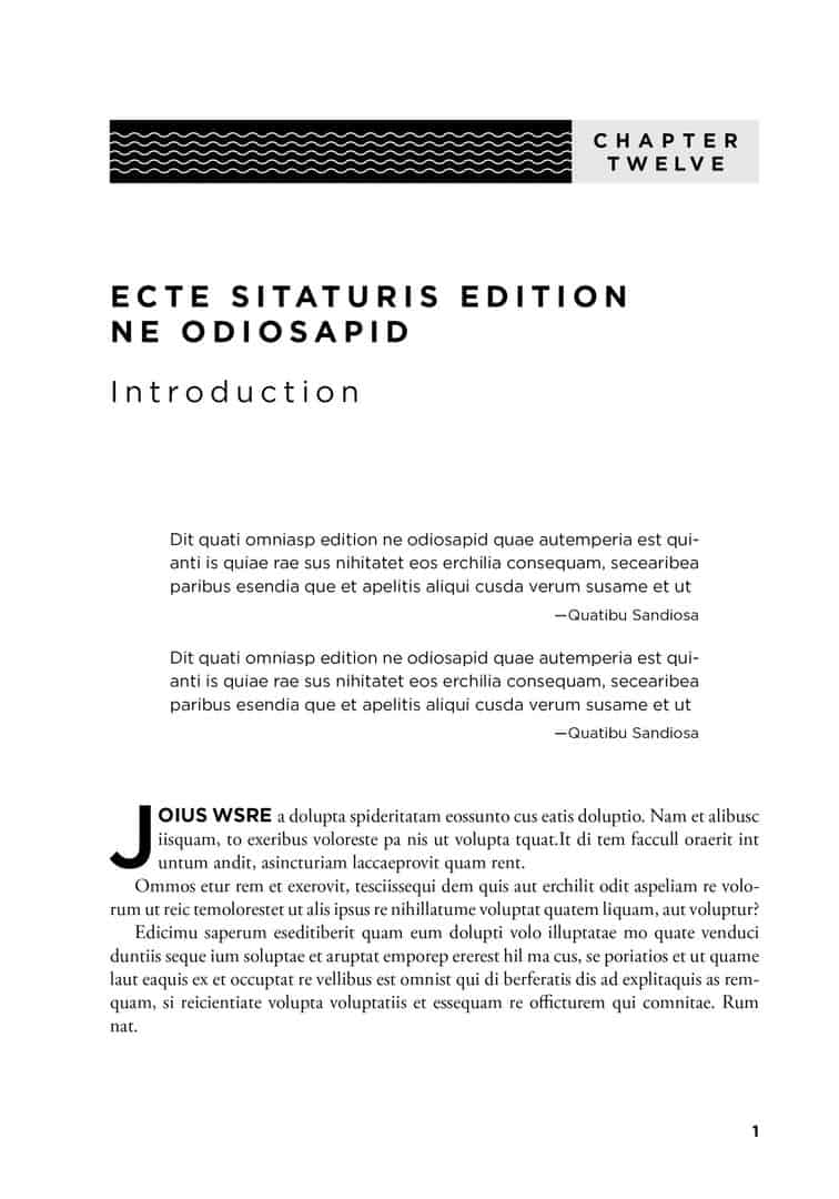
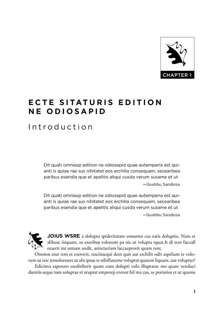
Here are a couple of Chapter Opener pages that I designed and typeset using dummy text.

PART OPENERS
Part Opener pages usually begin on a recto/right-hand page and feature a part number and part title. The title may be followed by a few lines of text, several pages of text, or no text at all.
Part Number The part number can be set in several ways: Part 1, Part I, or Part One. Sometimes the word “Part” is omitted entirely; if so, it’s critical to design the page so that it’s clear it’s a part opener and not a chapter opener. One common way that designers do this is to use roman numerals for part numbers and Arabic numerals for chapter numbers: Part II, but Chapter 2. They may also capitalize “PART” and use cap and lowercase for “Chapter.” Generally the part number should be in somewhere between 12-point and 24-point type, though occasionally it can be much larger if it works for the design.
Part Title The part number is followed by the part title. The part title should be larger than the part number; between 24- and 36-point type is usually a good size. It is often set in boldface, though roman and semi-bold can work too. The same distinction between all caps and cap/lowercase can be employed to help distinguish the part titles from chapter titles.
Because part pages often don’t have any body text, they offer a great opportunity to be creative with design. Designers can use photographs, illustrations, dingbats, or even something as simple as a well-placed gray box to highlight the text. If the part opener ends on a recto, it is usually followed by a blank left-hand page (verso) to separate it from the chapters. Part pages generally take a drop folio (a page number at the bottom of the page) if there is text on the page and a blind folio (no page number at all) if there is no text.
CHAPTER OPENERS
Chapter Openers should, if at all possible, begin on right-hand pages (rectos). If a book is very long and has many chapters, clients may prefer for pages to start on either versos or rectos. This is sometimes unavoidable, but there are good reasons to begin all chapters on rectos only. It is visually less cluttered and it also allows for more flexibility should there be major changes at the page correction stage. For example, if entire pages are deleted from a chapter, the left/right page orientation will be affected only in the chapter from which pages are deleted and will not cascade throughout the rest of the book. It also makes losing a paragraph or two less likely to affect pagination.
One special challenge is chapter openers that consist of a “two-page spread.” In these spreads, the chapter opener begins on the left-hand page and continues onto the right-hand page.
While two-page spreads offer great creative opportunities, chapters must end on a right-hand page to accommodate the following chapter opener on the left-hand page. The typesetter can either lay out the pages carefully to make sure there is always text on the right-hand page or, if this is impossible, allow the right-hand page before an opener to be blank. If the first chapter in a book is a two-page spread, the left-hand page of the spread will be page 2, and the right-hand page before it will be page 1, often just blank. The chapter opener page takes a drop folio, a page number at the bottom of the page that is either centered or justified.
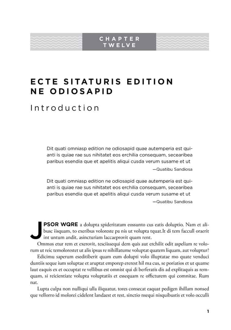
Chapter Numbers Like the part number, the design for the chapter number can be very simple or quite complicated. I use the word “chapter” in the majority of the books that I design, but definitely not all of them. The letters of the word “chapter” can be made into a graphic element and can be set in any number of eye-catching and attractive manners.
Chapter Titles The typeface for the chapter title is usually the same as that used for the part title, but not always. The type size for a chapter title might range from 20 to 24 points. The type size can get somewhat larger, but not too much smaller than 16 points or 18 points.
Drop Folios Page numbers are traditionally known as “folios.” The chapter opener usually has a “drop folio,” which means that the page number appears at the bottom of the chapter opener page. The drop folio is either centered or justified on the outside margins of the pages.
Drop Caps A 2- or 3-line drop cap is often applied to the first letter of the first paragraph on the chapter opener page. This means that the first letter of the paragraph is “dropped down” and enlarged to the depth of 2 to 3 lines of text. It’s also common to style the first word or two of the chapter opening paragraph in some attractive manner that is distinguished from the main text-something is simple as setting the first couple of words in all capital letters or styling the text with a different font, color, or shade of gray.
Body Text The typeface for the main body text can range from a minimum of 910 points to a maximum of 1213 points. Sometimes the type size will be larger or smaller, but most books fall with the 9 to 13 point range. There are thousands of typefaces on the market, but I generally choose from a small group of typefaces that are familiar and easy-to-read.
The leading, or space between lines of text, should be set at least 2 points greater than the type size. The main text size/leading can be set as large as 12/16, but 10.5/13 type is a good way to ensure readability and limit the page count.
The main body text is usually set in black even for books that are printing in full color. The other colors can be used to highlight headings and used as design elements, but black type is the easiet to read and therefore most commonly used.
TEXT PAGES
Continuing Text Pages usually have running heads or feet, which may include the page number, chapter title, chapter number, and/or author.
Aside from openers, all pages should have running heads or feet except for pages with horizontal text or images, known as “landscape” or “broadside” pages. Some publishers delete the running heads on pages with only tables or figures, but no regular text. Broadside text and images are usually centered vertically and horizontally on the page. An exception is when a broadside table is continued from a previous page. Then the top of the rotated text block can be aligned with the top of the horizontal page.
Subheads The first line of text on a chapter opener is often a subhead, also known as an A Head or 1 Head. Any number of subheads may follow, but a typical book will have 3 or 4 levels of subheads. Drop caps are optional when chapters begin with a subhead. The text following an A Head is usually set flush left, without the paragraph indent.
Subheads are typically set with type between 10 to 14 points with 2 to 3 points of extra leading. Readers should be able to immediately identify the hierarchy of subhead levels through the use of type faces, indentation, color, and dingbats.
Lists There are three main types of lists: bulleted lists, numbered lists, and unnumbered lists. Lists should be indented with a line space above and below for visual separation from the main text.
Bullets can be round, square, or any simple shape. For books that are printing in multiple colors, bullet points (or numbers, for numbered lists) can be styled in a different color or bolder font than the main text.
Extracts Quotations set as extracts are usually set in the main text typeface, a half or one point smaller, and indented on both the right and left sides. I usually keep the extract leading the same as the main text as it makes it easier to bottom align the pages. The indent should match the main text indent, which is typically between one and two picas or just under a quarter inch.
Here are two more sample Chapter Openers that contain a Chapter Number, Chapter Title, Chapter Subtitle, Epigraph, Drop Cap or Chapter Introductory Text, Main Text, and a Drop Folio.
OTHER BOOK DESIGN CONSIDERATIONS
Some of the best interior designs come from integrating elements from the book cover. However, the covers are not always available before design or typesetting begins. Sometimes elements from the interior design can end up on the book cover. When making design decisions, it’s important to consider which printer will be manufacturing the book. Some book printers are known to do a much better job of printing grayscales and colors.

- A Self-Publishing Tale: Part 3. Production Details. Layout and Design. - September 10, 2019
- A Self-Publishing Tale: Part 2. Cost, Categories, Keywords. - June 15, 2019
- A Self-Publishing Tale: Part 1 - May 17, 2019
